Sinking Ship Website
Clients
Sinking Ship Entertainment
Team
Sinking Ship Interactive
Roles
Strategy, Creative Direction, UI/UEX, Design
Launched
2022
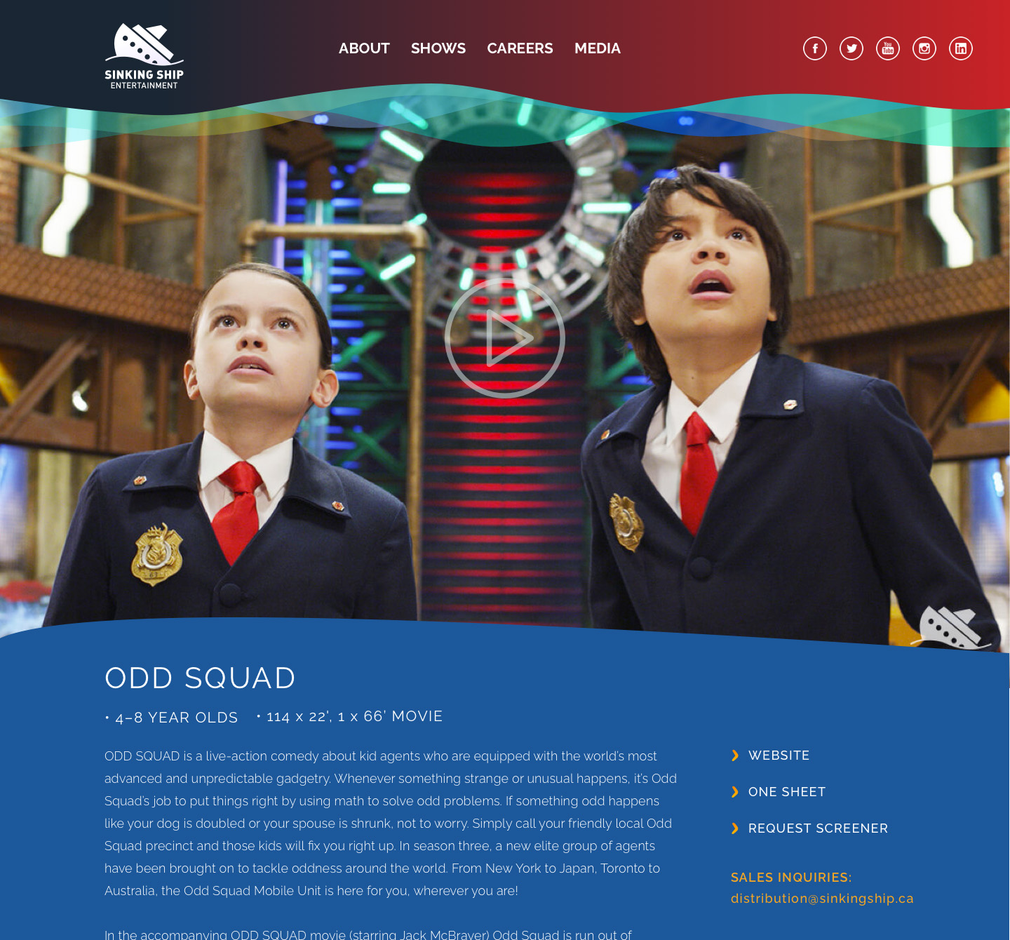
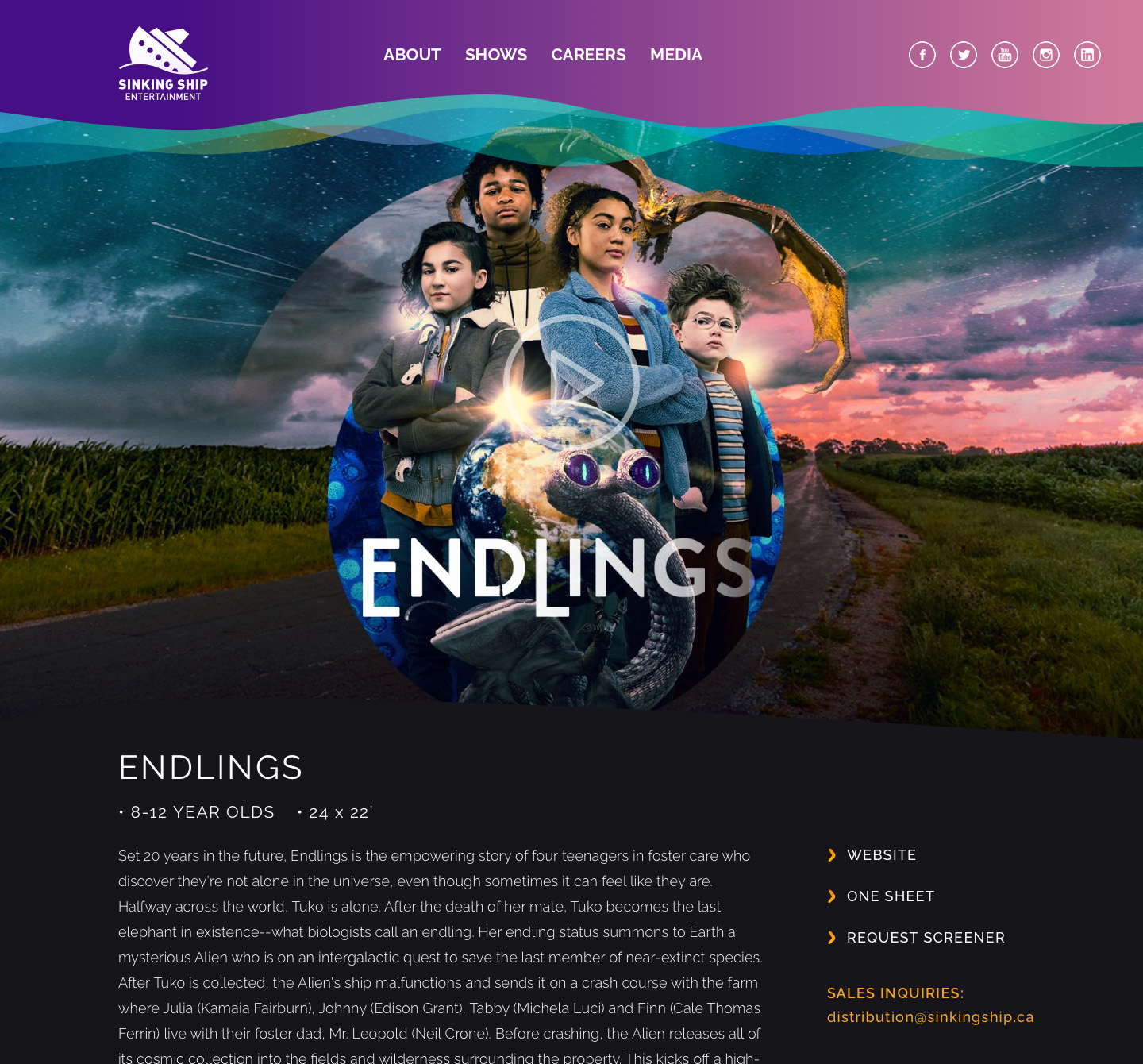
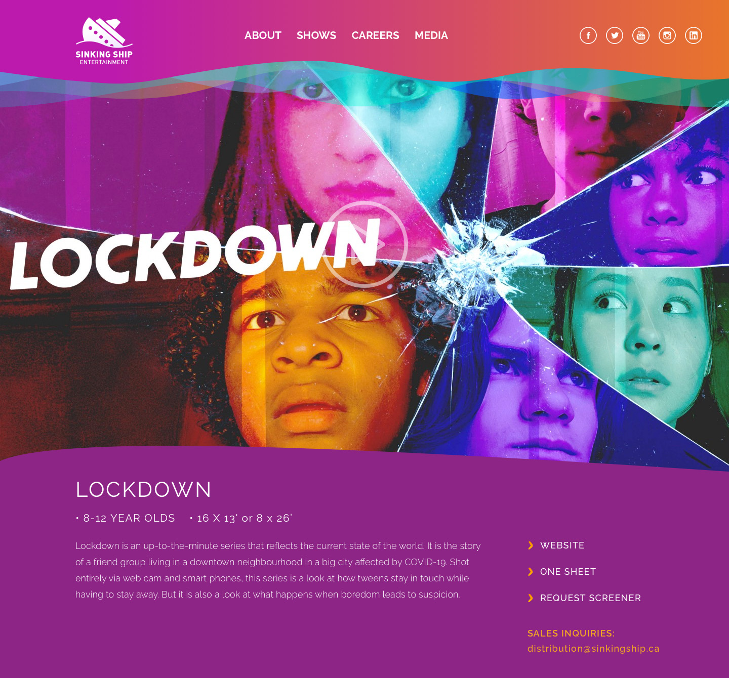
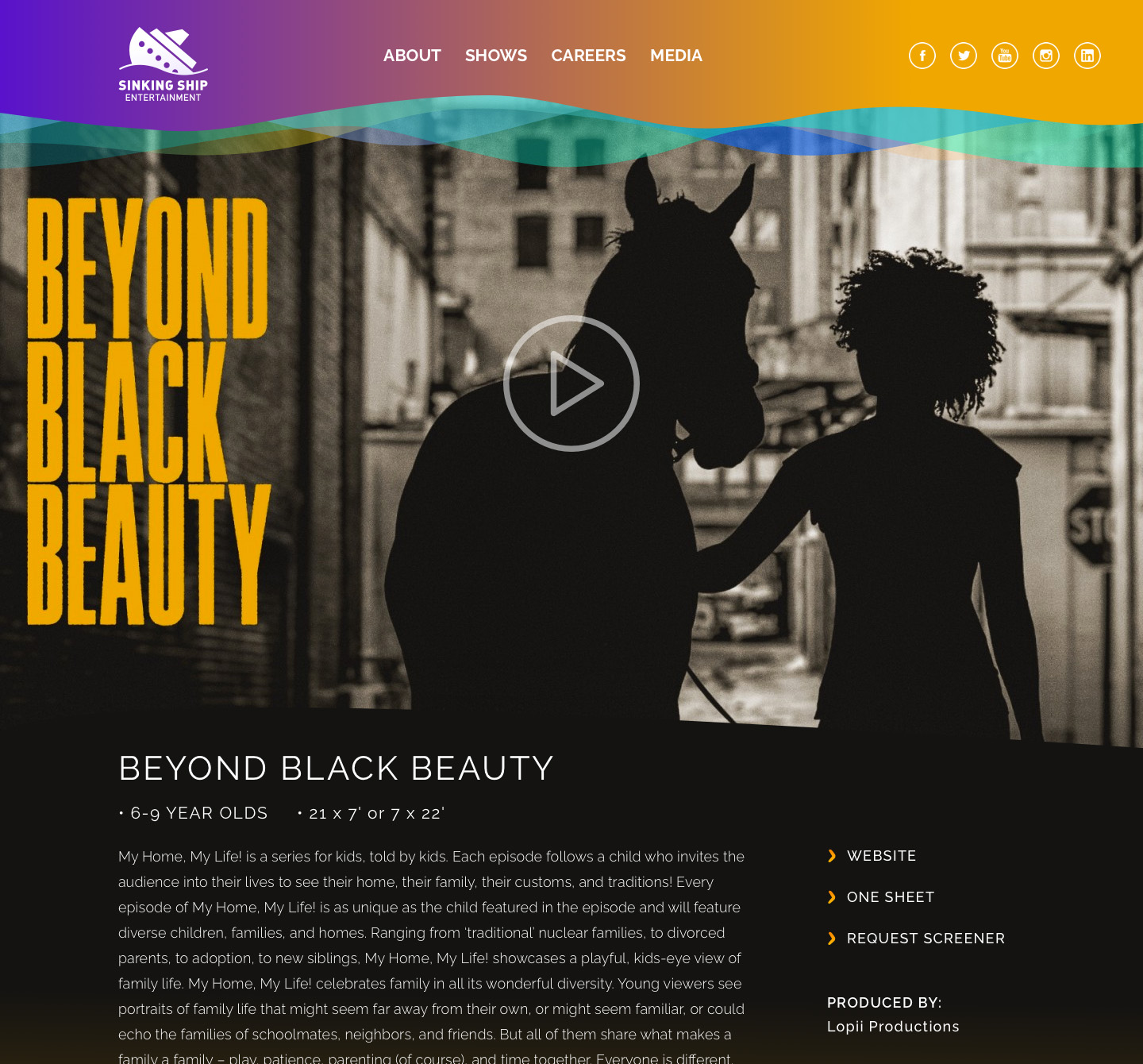
As a growing company with a diverse catalog of youth and teen series, Sinking Ship was in need of both a website overhaul, and an evolution of their corporate brand. Since its inception, Sinking Ship had preferred a more understated, playful brand that relied heavily on visuals of blue water and sea creatures. As the tone of their content evolved to include more serious productions, the branding system needed to support both playful pre-school series, as well as darker, teen mysteries and dramas. Additionally, they didn't want to completely abandon the water theme, but needed a system that allowed for a much broader palette and range of typography. The solution was a design system we called "shorelines": A combination of layered waves meant to mimic the way water recedes and moves ashore. These waves could be a endless combination of colours and shapes, allowing for maximum design flexibility while staying on brand.
2022 Rebrand
Layered waves of various tones and filters, combined with large, clipped imagery and variable-weight typography sets the stage for the Sinking Ship Entertainment brand as it continues to grow.


Refreshed Logo
The original logo had significant brand-equity in the Entertainment space, so an early plan to design a new logo was cancelled and the focus became modernizing and refreshing the existing wordmark.

TEAM
Julia Bales - UI/UEX Designer
Maria Manero - Director of Marketing
Adriano Bertuzzo - Logo Design
Drew Eastmond - Developer
Kevn Gan - Developer
Ronald Ruslim - Project Manager
Mark Cautillo - Technical Director
Maria Manero - Director of Marketing
Adriano Bertuzzo - Logo Design
Drew Eastmond - Developer
Kevn Gan - Developer
Ronald Ruslim - Project Manager
Mark Cautillo - Technical Director